Monday, July 12, 2010

Formatting the interior of your book


One comment that I’ve received frequently is that the interior layout of my historical novel, The Crown in the Heather, is on par with any traditionally published book. Of all the things an indie author can do when putting a book together themselves, formatting the interior is perhaps the easiest thing to do well – and without added cost, since you can do it yourself. In a previous post, I skimmed over some of the elements I used to give my interior a little more pizzazz. Here, I’ll expand on those.

What does it take to create a professional-looking interior layout to your book? Mostly, attention to detail, a little extra time and the willingness to learn about more features of Word than you ever cared to know. Like most writers, my manuscript was formatted in a specific way: 8.5” X 11” paper, Times New Roman font (12 pt.), 1” margins, .5”indents on new paragraphs, left-justified and double-spaced. Obviously, no real book is laid out that way.

How do you transform your manuscript into a professional-looking interior? By first studying books in your genre, using some as templates for your work and then making about a hundred little decisions to customize your interior so that it is uniquely your own. Here’s a list of some – but not all – of the decisions you will need to make:

1. Book size – Go to the library or a bookstore (Wal-Mart will do). What size are books in your genre, typically? Manuals with a lot of pictures, tables or graphs are probably better suited for a larger size like 8.5” X 11”, while paperback novels come in smaller sizes that are easier to tote around.

Initially, I had my book laid out in 5.25” X 8” size. But there were two drawbacks to this. One is that the shorter lines produced more hyphenated words, which meant more finagling to try to reduce how many hyphens were on a page, which led to more wonky spacing problems. Another was that it meant more pages – and like it or not, your printing service will charge you by the page, not the word count. So, I switched to 6” X 9” and got a book that was easier on the eyes and slightly more profitable.

* In Word 2007, simply go to ‘Page Layout’, then ‘Page Setup’, and click on ‘Size’ to choose.

2. Paper type – Although this is something you won’t have to worry about until you go to order your proof, you do need to consider how it will affect your reader. You have two choices: white or crème. White is appropriate for technical manuals or non-fiction with a lot of pictures and tables, but for novels you’ll most likely want to use crème, which has less glare and for long periods of reading is easier on the eyes.

3. Margins – Lightning Source recommends that on the pdf of your text file, that margins be at least .5” on all sides. I’d recommend more and here’s why. People need someplace to put their thumbs to hold the book open and you don’t need them prying apart the spine and cracking it just to see the words in the crease. At the top and bottom, you need a little space for headers and footers. Don’t crowd the page. It may daunt your readers.

* I used .8” margins on the right and left and 1” at the top and bottom.

4. Font – Choose a font appropriate for your genre and one that’s highly readable. You may be able to get away with a sans serif font for non-fiction or a contemporary novel, but Arial wouldn’t be appropriate for a medieval historical. Although we use Times New Roman for our manuscripts, because it was developed for use in newspapers with vertical columns, its letters are narrower and it’s generally not recommended for novels. While you may be thinking this will save you a few pages in the long run, in reality the narrower the font the harder it becomes to read for long periods.

While sans serif (‘without feet’) fonts may look fine and even be preferred on a web site, most novels use serif fonts. Not only are we more used to reading books in those fonts, but the little feet and tails actually make the letters easier to differentiate.

Except for perhaps chapter headings or the occasional brief letter, avoid script fonts.

Some recommended serif fonts for novels are: Garamond (this was my choice), Bookman, Century Schoolbook, and Palatino, but there are many more that work quite well – just don’t get too fancy. The font you choose will also affect your page count, so keep that in mind. Don’t be afraid to try different fonts, print out some pages and see how they look.

5. Point size – Which point size is appropriate will depend on your font. In Garamond, 12 pt. worked well. Obviously, if your book is intended for either very young or very old readers, you’d use a larger point size. Whatever you do, don’t go small just to save on page count. Readers will give up on books with print so small they need a magnifying glass – and I’ve unwittingly bought a few of these online myself.

6. Line spacing – Generally, line spacing of 1.15 works well.

7. Justification and hyphenation – Unlike your left justified manuscript, your book should have paragraphs that are full justified (even on the right and left side). A ragged right edge is the sign of an amateur. Poetry would, of course, be the exception.

Also, I’d suggest you turn hyphenation ‘on’. Without it, you’re likely to have lines that contain longer words get shuffled onto the next line, leaving the previous line with strung-out spacing. But do check each word that Word hyphenates. In mine, it kept hyphenating ‘bishop’ as ‘bis-hop’. Obviously the ‘s’ and the ‘h’ belong on the same line: ‘bish-op’.

8. Widows and orphans – Try to avoid the obvious short word that appears alone on a line of a paragraph or a short, partial sentence on a page by itself. Omitting or adding a word or phrase, breaking larger paragraphs into multiple ones or combining paragraphs can often solve these pesky little problems.

***[Edited to add that I turned 'Widow/orphan control' OFF. Word automatically turns it ON. This can be changed by going to 'Paragraph' in your task bar, then 'Line and page breaks'. Uncheck the box. If you leave it ON, you'll end up with some pages where the last lines of facing pages, left and right, don't line up as Word shuffles things around. Much better looking just to leave it OFF and adjust manually where needed.]

9. Headers and footers – Your headers (at the top of the page) will be your Title and Author Name. Usually, your name goes on the left-hand page and the title on the right. For these, you can choose a slightly fancier font, perhaps one that echoes what you’ve used on the cover, but again, keep it legible. Most often headers are centered, but they can be left/right justified, depending on which side they’re on.

Page numbers generally appear in the footer space (either centered or in the left/right corner), but will sometimes be placed in the upper outside corner. I’ve seen variations on headers and footer arrangements – some work, some don’t. If in doubt, check out several books in your genre and choose what looks best to you. For headers and footers, go to 'Insert', then click on headers or footers. When you click your cursor in the header space on the page, you can edit there.

10. Styles – This is the one feature of Word that, prior to designing my book’s interior, I never knew existed, but now I can’t live without it. Using Styles (shown at the top of your task bar) will allow you to remain consistent about chapter headings, for one. If you want to change which font you use for all your chapter headings or how many lines you put between the chapter number and subheadings, simply right click on the Style you use for that and re-format it to your specifications. This is a huge time-saver.

11. Front and back matter – If you are including acknowledgments, historical notes, a list of resources or anything else that may fall into either of these categories, pay attention to how they are arranged in traditionally published books and then do the same, including the insertion of blank pages to set them apart and whether they appear on the right- or left-hand page.

12. Fancy features – Yes, I get excited about Drop Caps (found under the ‘Insert’ tab). These can add a little flare to your book, but not all books need them. Again, pay attention to whether they are generally used in your genre or not.

I also used small caps (found under the ‘Paragraph’ tab) for the first four words of each scene to signal to the reader that there was a change in setting or time. Again, use selectively. It's possible to get carried away and overdo it.

***[Edited to add:]
13. Section breaks - While it might be tempting to just put page breaks at the end of a chapter, use 'section breaks' instead. This will let you turn headers off on the first page of a chapter, and page numbers off where you might have blank pages between the sections (Part I, Part II) of a book. To create a section break, go to 'Page Layout', then in the 'Page Setup' tab, click on 'Breaks'. You can add a page break that begins on the very next page, or the next odd- or even-numbered page.

To link your page numbers or headers to a previous section, simply click on the header or footer area and you will see a small tab that says 'Same as previous' if you want to repeat the headers. If, for example, you want to turn the page numbers off altogether (like in the back matter of the book), simply click on the 'Design' tab, go to 'Navigation' and unclick the 'Link to previous'.

As Lisa said in the comments to the post, this is one feature that can drive you batty learning it, but it's worth mastering.


There’s even more that I could add here, but these are the basics that you can probably get by with. Do take the time to lay out your book’s interior so that it’s virtually indistinguishable from a traditionally published book. A sloppily prepared interior will only give the self-publishing naysayers one more shell to load into their rifles to shoot indie authors down with.


Set your book above the rest. Take the time, make the effort to do it right, so that anyone who picks up your self-published book and starts reading it has as pleasant an experience as possible.

Happy publishing!
Gemi

Wednesday, July 7, 2010

Best Non-Fiction about Robert the Bruce


One wonderful aspect about historical fiction is that it entertains while educating and often inspires readers to learn more about a certain era or historical figure. Remember when the miniseries based on Alex Haley's Roots was on TV and people suddenly started researching their geneology? Okay, maybe some of you aren't as ancient as me, being somewhere past my 39th year, but fictionalized history, whether books or film, can get people excited about HISTORY.


In the many years I spent researching Robert the Bruce, James Douglas and Edward II of England for my Bruce Trilogy, beginning with The Crown in the Heather, I sifted through a lot of non-fiction. Mind you, when I began this project the internet wasn't as ginormous as it is now and we had this wonder of technology called 'dial-up'. Seeing as how I live in backwoods Ohio and scrape by on a perpetual budget, trucking off to panoramic Scotland or merry old England to rifle through dusty primary resources really wasn't an option. I once kept G.W.S. (Geoffrey) Barrow's Robert the Bruce and the Community of the Realm of Scotland checked out of my local library for close to three years. I had a system for returning the overdue book in the evening and going back the next day to check it out again. Imagine my panic when somebody else in Sprinfield wanted to read the book, too, and put it on reserve, thereby depriving me of one of my resources for a month. Over time I've collected a small library of my own, most of them by now pitifully dog-eared, highlighted and falling apart at the spine.


I maintain a Listmania list at Amazon.com called "Best non-fiction about Robert the Bruce" and have also included it on the About Robert the Bruce page of my web site. Although fairly comprehensive, it is by no means all-inclusive. If you have recommendations, please send them to me. What I've included are history books that anyone can read. You won't need a PhD in medieval studies to find them enjoyably informative and easy to read.


So, if you'd like to learn more facts about Robert the Bruce, the times he lived in and the events that shaped his life, here's a list worth looking into:


  • Robert the Bruce, King of Scots by Robert McNair Scott - This account of Robert the Bruce's life and times is an indispensable resource. If you only ever get one book on the Bruce, get this one.


    Robert Bruce: And the Community of the Realm of Scotland by G. W. S. Barrow - Details Robert the Bruce's rise to the throne and his forging of a kingdom. (I managed to keep this book checked out of my local library for close to three years by returning it and then going back the next day to check it out again.)


    Robert the Bruce: A Life Chronicled by Chris Brown - Fantastic for its compilation of primary sources. There's even a section devoted to John Barbour's 'The Bruce', written in Scots.


    On the Trail of Robert the Bruce by David R. Ross - As with Ross's other books, this one is highly readable and worth having, especially if you're ever in Scotland and really want to see where history happened.


    Bannockburn by Peter Reese - This book focuses on what is perhaps the most pivotal event in Scottish history with great clarity.


    James the Good: The Black Douglas by David R. Ross - Ross's 'James the Good' pays due homage to the Bruce's most valuable right hand man, James Douglas.


    King Edward II: Edward of Caernarfon His Life, His Reign, and Its Aftermath 1284-1330 by Roy Martin Haines - Not a light read by any means, but highly detailed and thoroughly researched. If you want the specifics of Edward II's life, this is a valuable resource.


    The Three Edwards (A History of the Plantagenets) by Thomas B. Costain - Although much of the information in the book is dated, Costain writes non-fiction in an easy to read, succinct manner.

Happy reading,

Gemi

Wednesday, June 30, 2010

Die a Dry Death by Greta van der Rol


Based on a true story, Die a Dry Death is a fascinating historical adventure that ratchets up the tension with every turn of the page. Greta van der Rol's accomplished debut novel is a gripping exploration into both the endurance of the human spirit and its darker side. Steeped in authenticity, Die a Dry Death is sure to impress even the most demanding of historical fiction readers.

In 1629, the Dutch ship Batavia is on its maiden voyage from Amsterdam to the East Indies when an uncharted reef snags its hull. Captained by the gruff, yet sea-wise Adriaen Jacobsz, the crew has just enough time to unload most of its passengers and essential cargo and head for a nearby string of islets, before the sea claims the once glorious Batavia. But the land that they seemed to have been so blessed to find is barren: rock-strewn, sun-baked, scant on animal life and lacking in fresh water. The only hope of rescue is for Captain Jacobsz and the ambitious Commandeur Pelsaert to set out across unknown seas with a small crew in the longboat, leaving a hundred and eighty survivors of the shipwreck to fend for themselves.

As the survivors begin to realize that their dwindling supplies may not be enough to sustain them until help arrives, mayhem quickly ensues. But when Under Merchant Jeronimus Cornelisz, third in command, escapes the sinking ship and arrives on the island called Batavia'a Graveyard, order is seemingly restored and even the lovely Lucretia van der Mijlen is reassured by his charm and authority.

Soon, however, it becomes apparent that the greatest threat to their survival is not the scarcity of food and water, but the very man to whom they have looked for leadership.

The most intriguing aspect of this story is how the author skillfully unravels one man's motives for gaining power through use of fear and examines to what lengths a person will go to preserve his own life. With such complex and deeply motivated characters, conflict abounds, creating a fast-paced and thrilling read.

Peppered throughout are exquisite details: of vivid seascapes, clothing, work implements, and nautical terminology. Readers who love to be immersed in a historical period will appreciate the precise research that has gone into this work; while those who enjoy an action-oriented and plot-driven story will be riveted.


(Also available for Kindle)

Saturday, June 26, 2010

D-I-Y with Kindle, by Lisa Yarde

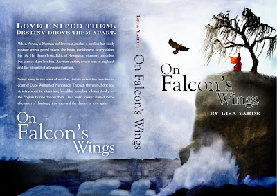
My fellow blogger over at The Historical Novels Review blog , Lisa Yarde, has just published her first book, On Falcon's Wings, on Amazon's Kindle. The lovely cover was done by the amazing Lance Ganey, graphic artist extraordinaire.

If you love medieval fiction and discovering promising new authors, check out On Falcon's Wing's on Amazon. Meanwhile, here's a teaser to pique your interest:

Love united them. Destiny drove them apart.

When Avicia, a Norman noblewoman, makes a careless but costly mistake with a prize falcon, the brutal punishment nearly claims her life. Her Saxon lover, Edric of Newington, witnesses her ordeal but cannot share her fate. Another destiny awaits him in England - and the prospect of a loveless marriage.

Swept away in the arms of another, Avicia enters the treacherous court of Duke William of Normandy. Through the years, Edric and Avicia unite in a timeless, forbidden love, but a bitter rivalry for the English throne divides them. In a world forver altered in the aftermath of Hastings, hope rises - and the chance to love again.

After grilling Lisa about her Kindle uploading experience, I asked her to write a guest post for My Dog Ate My Manuscript on how to upload to kindle. (Thanks so much, Lisa!) So here now is her D-I-Y with Kindle:


DIY with Kindle: How to upload your file and keep your sanity

Self-publishing is not for the faint of heart. Anyone who’s written, edited, and marketed their own work truly deserves a medal for bravery. As if it weren’t difficult enough to accomplish these things on your own, publishing to the Kindle requires another feat of daring.

Media giant Amazon.com allows authors to publish directly to its exclusive Kindle device, using the Digital Text Platform. If you’re an Amazon user, it’s easy to set up your account, complete your author information and upload your JPEG-formatted cover, but in my experience, the file upload process can drive an author crazy.

Despite my own tech savvy (I’m the reluctant guru of all technologies in my home and office), I wasn’t…fully prepared for the little things that could go awry with the upload process. Like how the upload changed every Wingding symbols in my Word 2007 document, separating sections, to bland, boring rectangles. Or, that it would alter the margins and indents in my original document. Also, if you’re considering taking the Kindle publication route, and you have a PDF of your manuscript ready, start converting it now. At this time, Amazon DTP does not accept PDFs.

Here’s a how-to guide for uploading a Word 2007 document for Kindle publishing, steps I used to successfully complete the process, without being a Kindle owner. It only took 26 tries to perfect. That’s twenty-six, in case your eyes just glazed over that number.

1. Open up your manuscript in Word and save it preferably under another name, differentiating it from the original document.

2. Format your new document to standard one inch margins, with single spaced lines. You may have to try several times with the indents; I found margins of 0.5 inches were preserved.

3. Remove and/or replace any fancy symbols you’ve used in the document for section breaks. I replaced mine with a simple diamond shape from Wingdings.

4. Remove the page numbers, which will not be preserved on a Kindle.

5. Turn on the formatting to view your paragraph marks. It will help you find any errors in the document; weird spacing, blank pages, etc.

6. Now, save the Word document as type: Web Page, filtered (*.htm, *.html).

7. You will receive a popup, “Saving in this format will remove Office specific tags...” Click Yes to save.

8. All formatting, including page breaks, will be invisible because Word displays the new HTML document in Web layout. Go to View, and then click Print Layout to ensure the page breaks are preserved.

9. Sign into Amazon DTP. Follow the steps to enter the product details, confirm rights etc. if you haven’t already this process.

10. At the Upload & Preview Book webpage, upload your HTML document.

The Amazon DTP users’ group is also available, if you still encounter difficulties with the upload process. Take heart from the obvious fact that you’re not the only one having trouble, and good luck with your Kindle publishing.

(Lisa Yarde is the author of On Falcon’s Wings, available on the Kindle, June, 2010.)


Happy Publishing,

Gemi


Thursday, June 24, 2010

696th Anniversary of the Battle of Bannockburn


696 years ago today, the Scots faced a force of Englishmen nearly three times larger than their own across the expanse at Bannockburn. Outnumbered and inferior in weaponry, after an arduous and bloody battle, they rose against improbable odds to win the day.

The Battle of Bannockburn was fought on June 24th, 1314. It was never in Robert the Bruce's plans to face the English on the battlefield in full force. Guerrilla tactics - ambush, burning crops and driving off livestock so the enemy could not have them, and taking fortresses by surprise and later razing them - had proven highly successful. However, thanks to his impatient brother, Edward Bruce, things fell out a little differently. One year before, Edward Bruce had laid siege to Stirling Castle, but being the restless sort, he quickly struck a deal - that if the castle was not relieved one year from then, it would be handed over to the Scots. Of course, Edward II of England was not going to let it go so easily. He marched north, thinking he only need show up and the castle would be his without question.

Edward II, however, assumed too much - and he was not at all the shrewd commander or the ruthless leader that his father, Longshanks, had been. Supplies and knights were late arriving. The English column that slogged north through the summer heat was large and unwieldy. They arrived only one day before the appointed day.

And Robert the Bruce had been granted a year to prepare for the battle that would determine not only his fate, but that of Scotland's as well.

Pits had been dug across the carse, littered with caltrops - star-like spikes of metal meant to maim horses and render them useless - and covered over with sticks and grass to hide them from charging cavalry. Barriers had been lain across the paths in surrounding woods to slow any English detachment that might dare detour from the main road in an attempt to relieve Stirling Castle. And the Bruce had drilled his men rigorously and plotted his strategy in great detail.

It was on the evening of June 23rd that the Bruce clashed, hand to hand, with the English knight Sir Henry de Bohun. It is said Bruce cleaved his skull with one swipe of his axe. There must have been a moment of terror in Scottish hearts as the enemy charged at their king. And then a whoop of elation as his enemy fell dead in the first pass.

The following morning on the 24th, both sides rose at dawn, took Mass, and prepared for battle. Leadership was lacking on the English side. A small detachment of cavalry advanced, only to be thwarted by the Scottish schiltrons - a hedgehog-like formation of pikemen. The Welsh archers - that terror of the English army that had on so many occasions been used to such devastating effect - were deployed too late. The English were now sandwiched between the rising waters of the Bannock Burn and the advancing Scottish forces. Some of them began to flee - back, into the burn. Those that were not lucky enough to escape to the other side, drowned in the burn or died at Scottish hands.

King Edward II was one of those who managed to escape. But when he and his small party reached Stirling Castle, Sir Philip Mowbray refused to allow him entrance, stating that judging by the turn of events the castle was not relieved. Edward fled on horse all the way to Dunbar Castle, pursued by none other than James Douglas.

For more information on the Battle of Bannockburn, including site maps and a sequence of events, check Lin Anderson's MacBraveheart page.

Here's a wonderful little YouTube overview for those of you who like a visual.

If you're feeling really academic and would like to learn more in depth, I recommend Peter Reese's book, Bannockburn.

And this is when I slip in a plug for my favorite Celtic band EVER: Old Blind Dogs!

Happy reading,
Gemi

Monday, June 21, 2010

Juggling: The Life of an Indie Author

Having come this far, there's one thing I will tell anyone considering becoming an indie author: Don't even consider it unless you EMBRACE the concept of multi-tasking to the Nth degree.

There are a hundred things I ought to do, should do, and plan to do in regards to my writing and publishing, BUT (and this is true for all writers) this annoying thing called 'life' keeps getting in the way. You know how it is. Hungry eyes above gaunt cheekbones turn on you, little whimpering sounds leaking from trembling mouths, asking when dinner will be. To which I often reply, "Do you remember how to use the microwave?"

Then there are the urgent pleas, which only you The Responsible One, can attend to. "Oh yeah, mom, I need a passport/driver's license/sports physical/rabies shot . . . tomorrow."

And because you are a writer (really, how long can it take to dream up a story and pound out 300 pages?), you must have oodles of available time - right?

Back in the Dark Ages, I used to be ORGANIZED. I made lists. I crossed items off those lists diligently because I have this obsession with creating closure. I saw things that needed fixing, needed to be completed, to be accomplished for the greater good of humanity and why delegate when it was so much easier just to shut up, save the instructions and do it all myself?

Then, life came to a whiplash-inducing halt. And I realized that to keep stress under control and have some time left over to actually enjoy those fleeting moments that happen upon us unexpectedly (fireflies in summertime, the smell of impending rain, laughter shared with friends) that it was OKAY not to do it all or have to do it perfectly. I stopped making lists and instead operated on an as-needed basis. This meant, basically, operating in a purely crisis management mode - which really killed productivity.

So I'm back to making lists. But they are simply reminders. Not demands.

Here's the tricky part - as an indie author, there is no escape from real life. The two-legged critters need fed, reminded to do their homework and they still want their parents there at important events. The four-legged critters still need fed, played with and taken to the vet at inconvenient times. The spouse still needs fed and would like to be assured that your butt is not glued to your swivel chair and your fingers stuck to the keyboard - so you assure him with dinner out, during which you're probably wondering if you'll be able finish a rough draft on Chapter 56 before vacation or if you can squeeze some writing in on the plane.

Life surrounds you and you must still manage to carve out the time to write, make edits, format, submit files, correspond with your graphic artist, chat on genre forums, outline the next book, check your Amazon ranking (oops, forgot to do that today, oh well), review, blog and yes, Twitter.

There is no editor or agent pushing deadlines at you. When, how and if things even get done is entirely up to you. It's both liberating and terrifying. Only attempt self-publishing if you're SELF-MOTIVATED.

Quick News Flash - The Crown in the Heather was ever so briefly #7 on Amazon.co.uk for Biographical Fiction last week! Woot woot!!! And it hit the dizzying heights of #16,077 overall on Amazon.com. I'm still getting over the embarrassment when folks ask me to sign a copy. Who? Me???

P.S. If anyone wants to follow me on Twitter, I'm @NGeminSasson. I'm still learning the ropes and am slowly getting over the feeling of being stalked, but at least blogging has already cured me of the fear of being a blabbering extrovert.

P.S.S. CITH's price went up to $12.59, but hey, that's still 10% off.

Happy publishing,
Gemi

Wednesday, June 9, 2010

What does it really cost to self-publish?


Over the weekend, when both Amazon.com and Barnesandnoble.com discounted my book, The Crown in the Heather, from the list price of $13.99 t0 $10.07 (a whopping 28% off), a couple of people asked if that meant I'd be earning less per book. In short, the answer is 'no'. I still earn the same amount whether they list it at full price, 10% off or 50% off.

The list price I set for CITH is $13.99. The discount I set for wholesalers (such as Amazon.com) is 20% of that, which means that they buy it for 80% of the full price, which is $11.92. So, yes indeed, at 28% off they are selling it at a loss. The only explanation I can give is that since they've just given you such an ubelievable bargain, they expect you'll buy something else while you're shopping online. It must work, or else they wouldn't do it so often.

How much of that $11.92 do I get per book? Well, quite a bit more than I'd get from the royalties per book if I were contracted with a mainstream publisher; however, keep in mind that without the bookstore exposure and marketing boost that a traditional publisher provides, my sales volume won't be nearly as great. First, I have to pay Lightning Source to print the book. That amounts to 1.3 cents per page plus 90 cents per book. (298 pages X .013) + .90 = $4.77 to Lightning Source.

Using my 8th grade algebra, here's the math for what I earn per book:

($13.99 X .80) - $4.77 = $7.15 per book.

BUT . . . there are initial start-up costs and other fees that have to be factored in, too. Fees to Lightning Source, the cost of ISBNs, cover design, interior layout and editing . . .

If I haven't yet mentioned it, author K.L. Brady's blog, Indie Publishing on the Cheap, has some excellent tips on how to wisely pinch pennies when self-publishing.

Now on to accounting for the nickles and dimes . . . Here's a quick run down of my basic costs:
  • $25 - 1 ISBN (I bought a block of 10 for $250)
  • $75 - Set-up fee per title for Lightning Source
  • $30 - Proof copy from Lightning Source
  • $12 - Annual catalog fee to Lightning Source
  • #$119 - 20 copies from Lightning Source (to be used as review copies and gifts)
  • #$160 - Cover design and pdf file of cover (based on my basic design and using a photo I provided) (I also purchased a logo design for $60, which I'll be able to use on successive books.)
  • $20 - approximate cost for a single photo from http://www.istockphoto.com/ (this will vary, depending on how many photos you buy at once, the specific photo and the size [resolution] of the photo purchased) (I actually bought a supply of credits and purchased additional photos which I can use on my web site, for a book trailer if I do one, and for other books.)

Total start-up costs:

$25 + $75 + $30 + $12 + $119 + $160 + $20 = $441

Divide that total ($441) by the amount earned per book ($7.15) and I need to sell approximately 62 copies to earn my start-up costs back for this book. Not bad and definitely doable.

I could have spent a great deal more on professional cover design or artwork - in fact, I would have loved to - but since my other income is, well, nil, this is one area I had to be economical in. And judging by the comments on the cover, I think it serves its purpose well. Professional editing is another area I would love to splurge in, but done right it is not a cheap job, either; so instead, ten very intelligent writers, whose opinions and abilities I trust, read the whole book at various stages and gave feedback, as well as corrected my technical errors. Yes, this means I read ten manuscripts in return and got great mileage out of my copy of The Chicago Manual of Style.

This is just my experience and how I chose to go about doing it. Publishing through Kindle or CreateSpace will lower your costs, while going through a subsidy publisher or employing professionals for specific jobs (editing, cover design, publicity) will raise it accordingly.

Until later,

Gemi